Knowledge-Based Method Logo: The Power of Thoughtful Branding
It took me a long time to create the “Knowledge-Based Method- KBM, monetizing ideas with purpose” logo on point. I wanted to get the branding right for the project, so I had to strategize and think beyond the logo.
A logo is much more than just a design; it’s the first visual cue your audience receives, shaping how they perceive your brand. When designed with thought and precision, a logo becomes a key asset in your branding toolkit, reflecting not only your business’s visual identity but also the values and emotions you want to convey. It can also be tricky when you do something from scratch or need to rebrand.
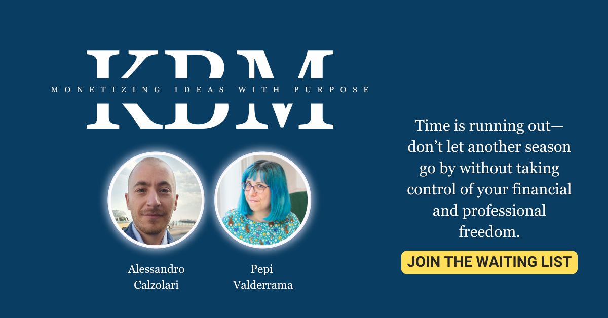
Knowledge-Based Method- KBM, monetizing ideas with purpose
Before we explore the example of KBM’s logo, we need to understand what it is. The KBM course offers a bold shift for those who feel trapped in an economic climate that only rewards hours, not ideas. In an era where instability is the new normal, KBM is here to equip you with the tools to rise above the noise and claim your worth.
In KBM, you learn to:
- Transform Time into Ideas: Stop sacrificing your hours and start creating lasting, undeniable value. Imagine the power of attracting clients who respect and seek you out for your ideas—not because you’re competing in a price war.
- Build Unshakable Resilience: Develop the kind of calm strength that not only endures but thrives during market turbulence. It’s widely believed that resilience is rare in today’s relentless economy—are you ready to be one of the few who has it?
- Deploy Practical Strategies: Each week, we deliver hands-on, action-based guidance to help you unlock your unique strengths. This is your roadmap to establishing a competitive edge that no one else can match.
- Join a Community with Purpose: Become part of a group that values bold ideas and meaningful growth. There’s strength in numbers, and our community is made up of like-minded individuals who are done trading hours for less-than-deserved rewards.
Nailing the Font
The font used in a logo carries significant meaning, often subconsciously impacting how your audience feels about your brand. Think about the example of Georgia Pro, a typeface that is classical yet adaptable. Georgia Pro, paired with a navy-blue background, evokes a sense of strength, reliability, and authority. The sturdy serifs suggest tradition and trustworthiness—qualities that may be perfect for a law firm, financial service, or educational institution.
Now imagine a tech startup that wants to communicate innovation, creativity, and a modern approach. The Georgia Pro typeface might not serve that goal effectively. Instead, a sans-serif font like Helvetica or a custom geometric typeface could convey modernity, minimalism, and a forward-thinking ethos.
In the case of “Knowledge-Based Method- KBM, monetizing ideas with purpose,” I needed something that conveyed authority, reliability, and freshness. Also, the idea that transforming is as easy as the logo is. Easy, yet compelling. Simple, yet robust.
The Perfect Color
Colors are perhaps one of the most evocative elements of logo design. They have a powerful effect on emotions and can significantly influence how people perceive your brand. In our earlier example, the navy-blue background adds a layer of meaning to the font choice. Blue is often associated with trust, professionalism, and calm—desirable qualities in banking, insurance, coaching, or healthcare industries.
Contrast this with a bright, funky color palette. Neon green or hot pink, for instance, sends a very different message—perhaps creativity, playfulness, or audacity. These are great colors for a brand that wants to come across as youthful or innovative, like a modern fashion label or a digital marketing agency.
Matching the Logo to the Brand Voice
A logo doesn’t exist in a vacuum. It must be aligned with your brand voice—the personality that comes through in your communication, whether on your website, in marketing materials, or on social media. A playful, colorful logo might suggest a brand voice that’s friendly, informal, and full of humor. On the other hand, a minimalist, monochrome logo suggests a brand voice that is sleek, professional, and sophisticated.
Think of your logo as the face of your brand. If the voice that comes through your communications doesn’t match the impression given by the logo, customers will feel a disconnect. For instance, if you have a funky, colorful logo that suggests fun and spontaneity, but your messaging is formal and highly technical, your audience might feel confused about who you really are. This dissonance can undermine your brand’s credibility.
Simple Looks, Deep Thought
Getting KBM’s logo right took me longer than you had in mind. The key to nailing the font was a challenge. Why? Because choosing the wrong font makes the logo fall flat. If you don’t listen to the project or what your client wants, you might give them the wrong logo. It has to speak to the right audience and represent all aspects of the brand.
- Brand Analysis: Before any design work, understand the core of your brand—what it stands for, who your audience is, and what feelings you want to evoke.
- Competitor Research: Analyze competitors’ logos and branding. The goal is to differentiate while remaining within your industry’s visual expectations.
- Audience Insight: Understand what visual cues resonate with your audience. Different demographics respond to other design elements, and understanding these can guide your logo choices.
- Design Elements: Select the fonts, colors, and shapes that best align with your brand’s personality. Create a design that is visually pleasing but also deeply connected to your brand’s message.
A Logo Isn’t Just a Logo, But it Isn’t a Brand Per se
A logo is not just a pretty picture; it’s an essential part of your brand’s visual language. When designed with care, a logo captures the very essence of your brand—its values, promises, and personality—in a way that resonates with your audience. Fonts, colors, shapes, and symbols are not chosen on a whim; they are deliberate choices made to evoke specific emotions and associations.
Remember, a logo alone doesn’t make the brand—it’s one piece of the larger branding puzzle, as we’ve seen with “Knowledge-Based Method- KBM, monetizing ideas with purpose.” However, when done right, it becomes a powerful tool that attracts attention and builds recognition and trust.
If you’re interested in learning more about KBM or need help with branding, don’t hesitate to contact me here. The Knowledge-Based Method course starts in January next year, but we have a waiting list, since spots are limited for the first cohort. Don’t miss it!